CASE STUDY
UI/UX Designer
On-Demand Beauty Service App for Artist and Users.


Role:
Introduction
Beatrix is a platform for Cosmetologists aka Beauty professional to find Customers and provide online booking service in their local area. The platform also works as an on-demand Wellness service provider for the users to get beauty services done in the comfort of their home.
Even though some of the competitors provide similar services, there has been a limitation to have a User-friendly platform providing customized on-demand services, not only for users but also for the Service providers such as Makeup Artists. Our goal was to create that People Friendly App to provide Booking service for each occasion or Customer needs and giving an easily manageable platform for artists to handle their bookings and services.
CHALLENGE
User Research and Competitive analysis
We did a total of 9 Interviews, 4 of them with Freelance Artists and for the user module, we interviewed 5 women with different backgrounds. All 4 artists were unsatisfied with the existing solutions or Apps in the Market and required something which would suffice them to get more clients efficiently and at the ease of their schedule.
Complex User flow, Poor UI, and difficult Bookings Management were the primary emphasized Issues. The pricing structure was also found to be one of issues resulting in dissatisfaction.
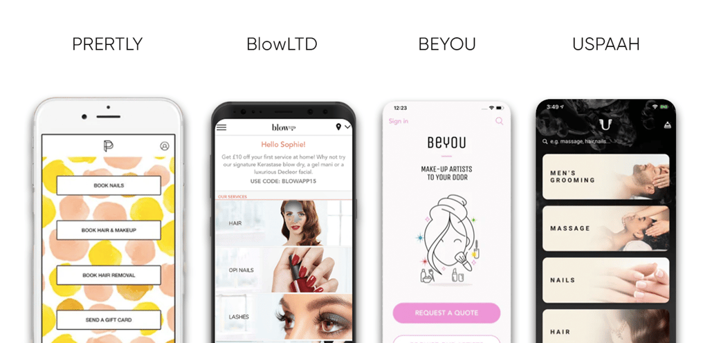
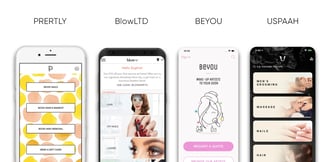
For my Competitive analysis, I looked at some indirect and direct competitions within the Beauty and Wellness services domain. Following are some of the competitors currently in the market that provide similar services:
Role - Lead UI Designer. Responsible for all high-fidelity designs, prototyping and usability testing.
Overview - My team and I were tasked with creating User Interface for this Cross Platform App. I was tasked to create UI Designs for Android, iOS, WebApp and Landing Page Website. The most challenging part of the project was to create User flow which can be easy for everyone equally in an interesting and engaging way that would still allow it to be readable and glanceable.
Deliverables: Personas, High Fidelity Wireframes, Lo-Fi MVP, Microinteractions, High-Fidelity Prototype, Mockups and Style Guide.
Tools - Adobe XD, Adobe Illustrator & Photoshop, Zeplin.
PAIN POINTS
Key Takeaway:
• Existing solutions don't provide much focus on Artist Users.
• UX is not very efficient for all users and requires smooth yet efficient User flow.
• No custom or personalized experience for the user.
Problem Statement:
Based on our brief and initial user research we used this information to create a problem statement. This allowed a more succinct direction for the project while knowing what main problem we were facing.
PROBLEM
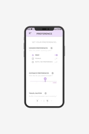
Artist: Artists users need a dynamic Interface that allows them to display their services more efficienlty and to easily navigate and manage their bookings and preferences hassle-free.
User: Users requires more service listings to choose from. Clear and presentable information about listed services. Easy naviagtion and quick bookings module with a personalized touch to it.
Solution
• Create a Dynamic User Interface and to make it Exciting and personal. It is important that the software feels personal and never to forget the users are real people.
• Colorful Designs with well organized Information. I wanted to make sure all the important details are presented in front and center with clear hierarchy using colour, size, and position.
• Clean UI, keeping in mind Less is More. Giving users too much information to look at can lead to sensory overload and could waste time in the long run. Also it can be a added challenge for Developer to Implement all the elements efficiently.
ARTIST: Freelance artist who wants a Bookings management app to handle her clients.
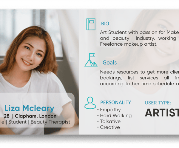
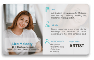
PERSONA
Next, I created personas for each user type, Artist and User(People), based on my initial user research. In the persona, I included the user's main goals and needs which were determined through my user interviews.
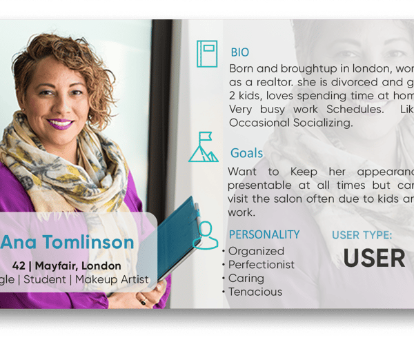
USER: A single mom who cant travel to salon and want to benefit beauty services at her home.
Process
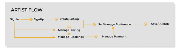
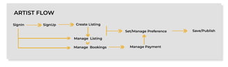
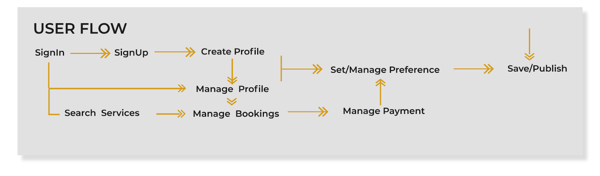
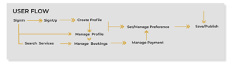
Userflow & Wireframes
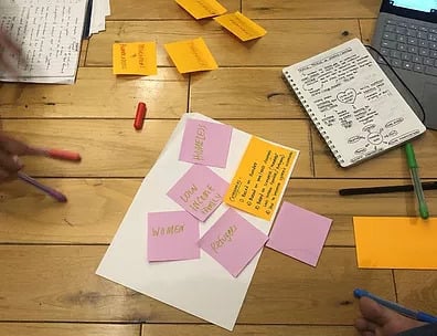
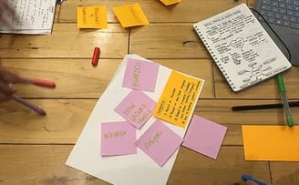
We decided to separate the App into two modules according to its two users, Artist, and User. Then with help of given inputs from the team and Insights, I created an basic Application map and used the 6-8-5 sketching method to create an outline of the important screens that I should include in order to meet the user's needs.
We did a Week Sprint seminar to facilitate the ideas where I included developer and stakeholder for best understanding.
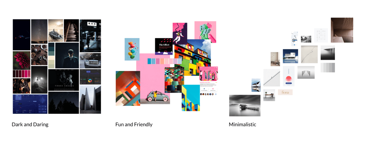
Moodboard
My first step was to create some divergent mood boards which would help me convey different aesthetic directions for the project. The Moodboards helped me get a feel for the project while helping me organise my ideas.
After discussion with developer and Stakeholders, we decided to go for fun and friendly color full design while keeping minimalistic approach.

High Fidelity
Prototypes & Mockup Screens
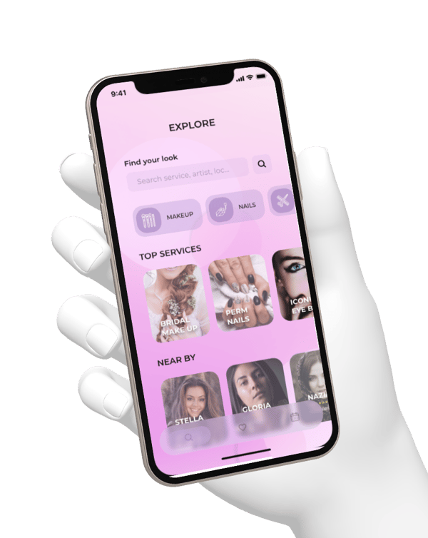
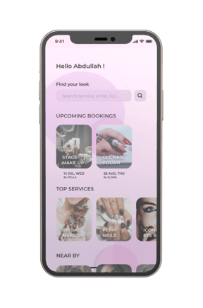

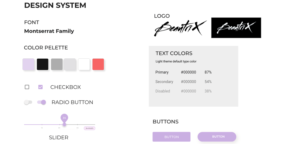
Based on Mood board and discussion with Stakeholder, we decided to go ahead with Colorful minimalistic approach. The team decided to with lilac Color theme to give it beautiful feminine and personal cozy feel to it.
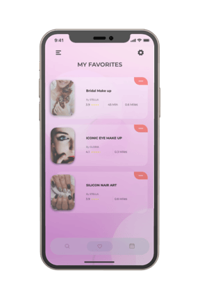
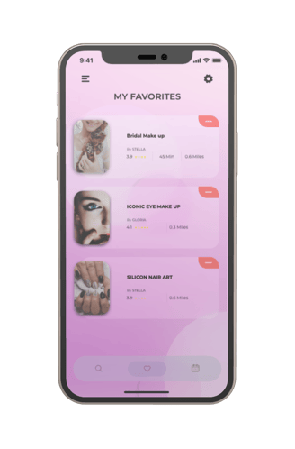
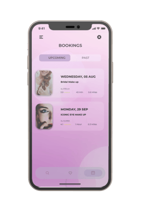
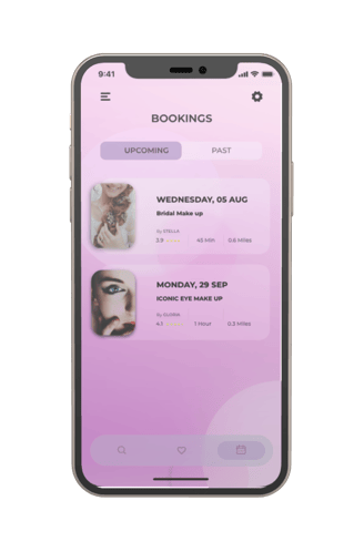
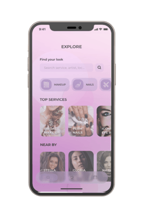
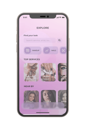
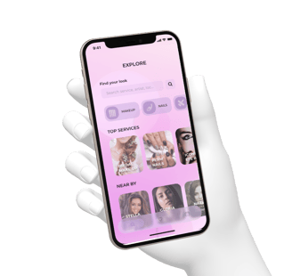
User Module
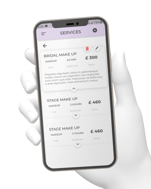
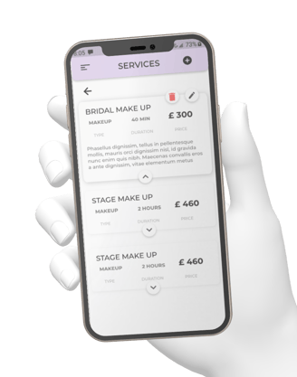

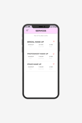
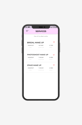
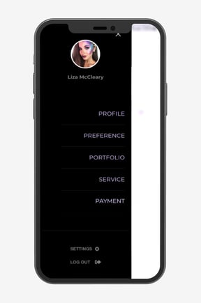

ARTIST MODULE
Prototype
Neural
I Created the Fully Interactive UI for the MVP of the App for Android, iOS, and Web App using Adobe XD. I designed some Micro-interactions as they allow the experience to be more interactive and engaging.

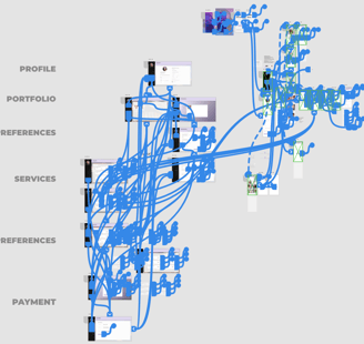
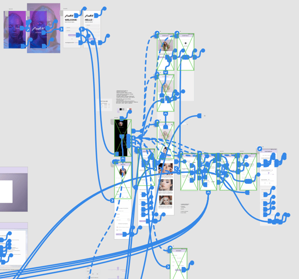
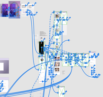
The whole neural network below shows all the interactive elements interconnected to Input nodes with conditional formatting for different use case scenarios, forming a live working UI of the App to experience the whole User flow from signup to payment and login to Booking.
This allowed the developer and stakeholders to process the usability of the app and reduce considerable development time.
Usability Testing
We conducted a Contextual inquiry during our Usability testing. Real Users, Stakeholders, and Team members were asked to perform certain operations and provide feedback. This helped us add additional information that was missed and remove certain misconceptions. It also helped the developer evaluate the development process and allow stakeholders to assess their Goals.

REFLECTIONS
CONCLUSION
I had really fun during this project and it allowed me to expand my knowledge of UX principles and processes. It was really great experience to be a part of such an awesome team. We went through all the pressure, the frustration, and the constraints but finally for all the hard work we were rewarded with the successful completion of the project.
I've gained a holistic view of a mobile application in terms of end-to-end experience and product strategies.
I explored a plugin for Zeplin and Adobe XD that can export code and design attributes for Engineers, which reduced a lot of workloads for me to walk through and mark up my design specifications, however, I spent quite an amount of time discussing and reviewing both visual and interaction designs.
I learned how to effectively convey my rationale and justify the design during the discussions back-and-forth, and I also realized that efficient and open internal communications would motivate the teammates and drive the entire project going in a better direction.